An app landing page is not a full marketing site. It is the scroll someone hits from a Product Hunt link, an Instagram bio, or a QR code on a flyer. They need screenshots, store badges or a download CTA, and enough proof to trust a tap. Framer helps when the file already frames mobile UI, not generic B2B SaaS hero copy.
This list ranks 8 free Framer templates tagged App in the directory, built for mobile or download-first launches, or carrying a dedicated Download route in pageNames. Fintech two-pagers sit next to CMS-backed mobile app files you can grow after TestFlight. Hub: free Framer templates. Full grid: template directory.
 Live Preview
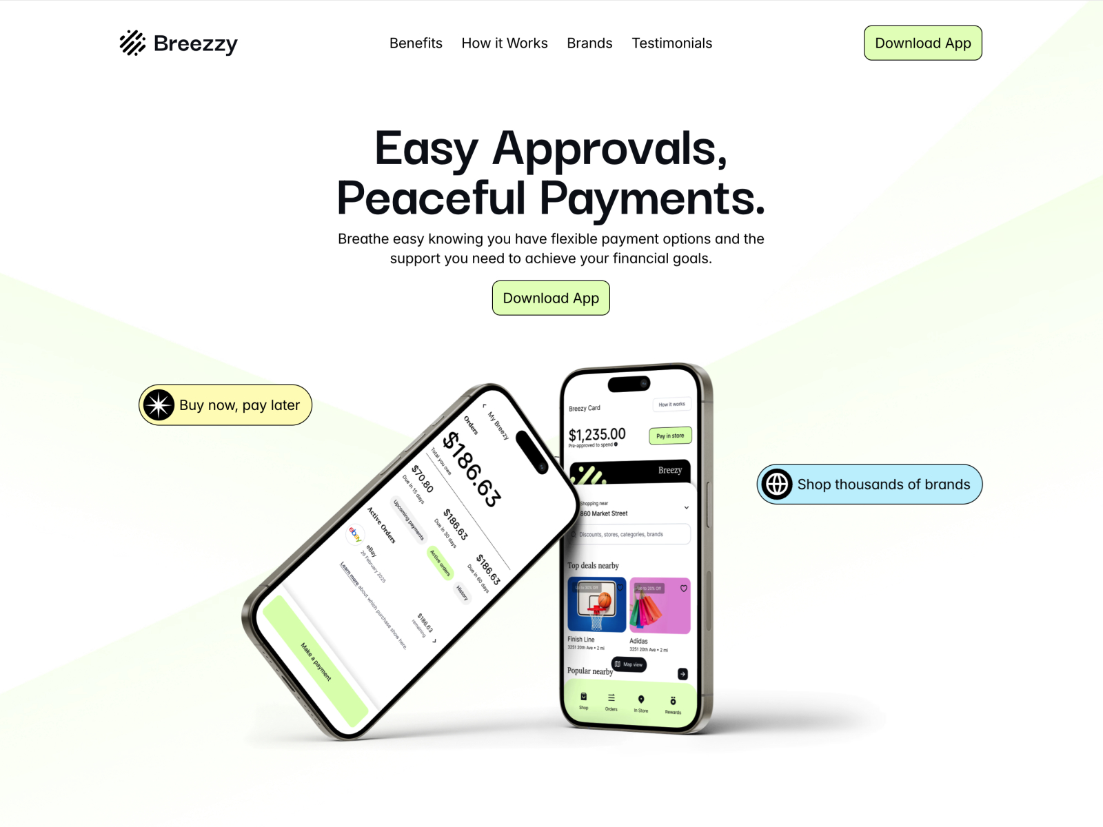
Breezzy · Neobrutalist fintech app scroll
by Mainnet Design
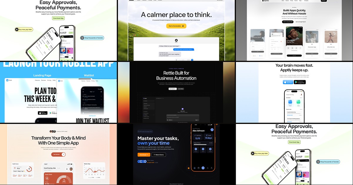
Breezzy by Mainnet Design is a two-page App and Fintech file with a neobrutalist skin built for payment apps targeting younger users. The homepage is the entire story: bold type, high contrast, and section rhythm tuned for store-badge CTAs rather than blog archives. Weakness: two routes only, so the moment you need CMS blogging or a pricing matrix you are extending the file yourself.
- Best for
- Split-payment and consumer fintech apps that need one loud conversion page
 Live Preview
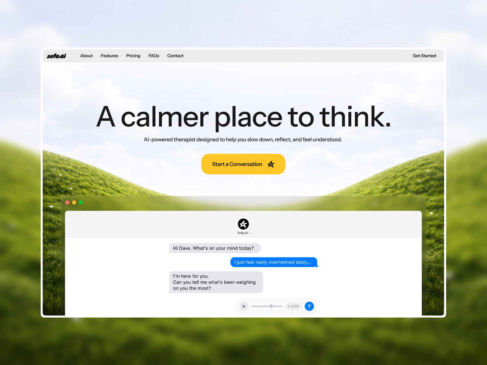
Sofa · Calm AI app landing without CMS noise
by dawe
Sofa from dawe carries App, AI, and Product labels across three static pages. The minimal palette and generous whitespace fit products where clarity beats gradient hype, and contact gives you a demo path without bloating the sitemap. Weakness: no blog, pricing, or changelog routes, so post-launch content marketing stays on the homepage or external docs.
- Best for
- AI and productivity apps that want trust before spectacle
 Live Preview
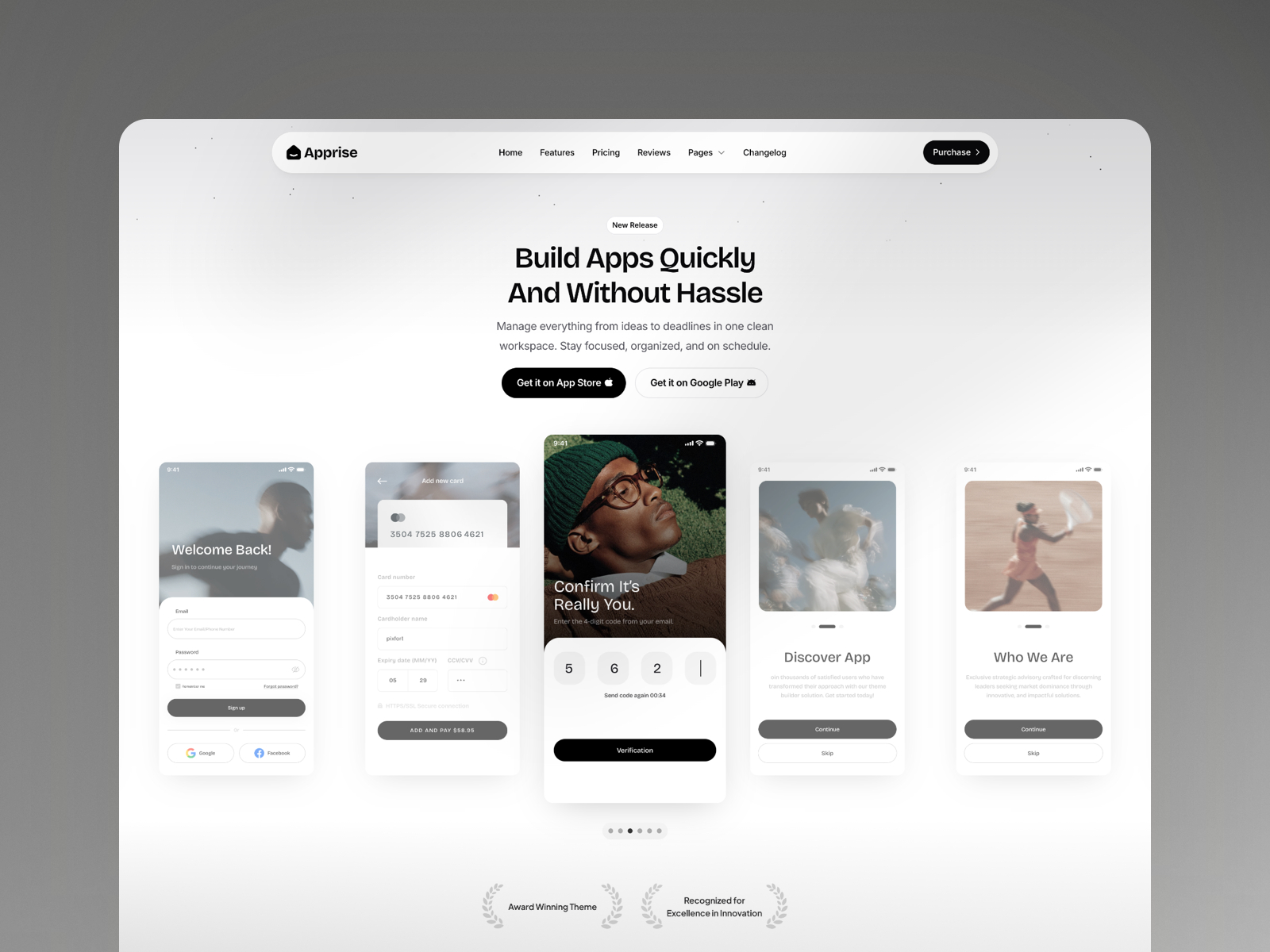
Apprise · Monochrome mobile app with CMS blog
by pixfort
Apprise by pixfort is six pages with App and Product tags, CMS blog, changelog, and legal routes. The monochrome system reads premium on phone mockups and gives you a credible update cadence before App Store review cycles finish. Weakness: no dedicated Download or pricing page in the shipped map, so store badges live on the homepage hero you customize.
- Best for
- Consumer and prosumer apps that publish release notes alongside store links
 Live Preview
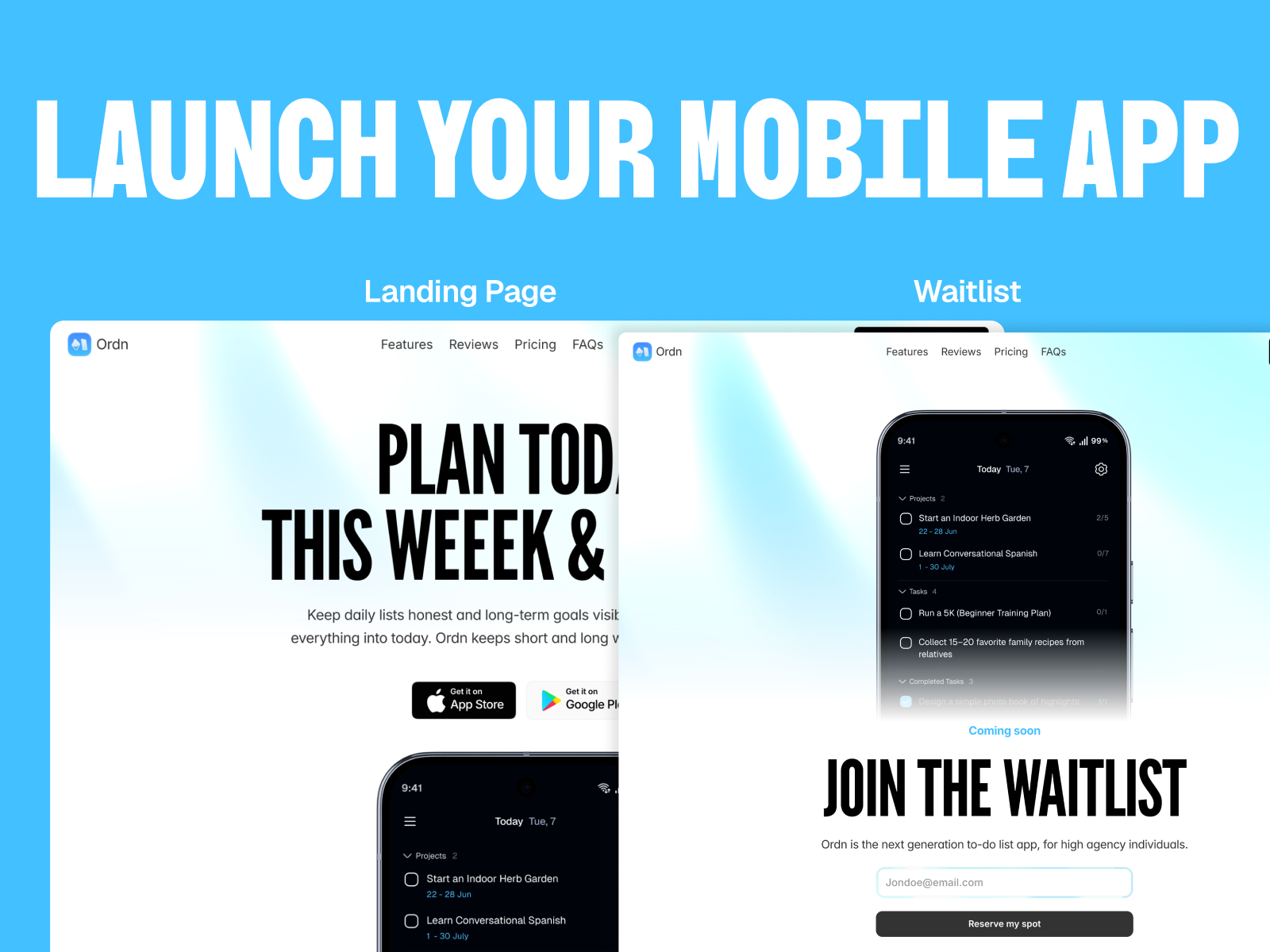
Mobile App Launch · Mobile launch file with waitlist route
by Oyegoke
Mobile App Launch by Oyegoke is five static pages including Waitlist, privacy, and terms, built explicitly for app launch narratives. The waitlist route pairs with homepage store-badge sections so you can gate access while TestFlight or Play Console review runs. Weakness: no CMS blog or changelog, so ship notes stay manual frame edits until you remix a bigger file.
- Best for
- Pre-store apps collecting beta signups before Play Store links go live
Quick comparison
| Template | Pages | CMS | Use-case fit | Skip if |
|---|---|---|---|---|
| Breezzy | 2 | No | Punchy fintech app scroll | You need blog or pricing routes |
| Sofa | 3 | No | Calm AI app landing | You want CMS release notes |
| Apprise | 6 | Yes | Mobile app with blog and changelog | You need a named Download page |
| Mobile App Launch | 5 | No | Pre-store waitlist plus legal | You are already live in both stores |
| Rettle | 7 | Yes | Dedicated Download route plus blog | You hate editing static pricing |
| Apptly | 7 | Yes | Indie app with compare and updates | You need enterprise security pages |
| Fithub | 3 | No | Fitness and wellness app story | You sell B2B software, not workouts |
| Focly | 6 | No | Developer app with API reference | You want light mode and soft gradients |
 Live Preview
Rettle · Named Download page in the sitemap
by OfScale
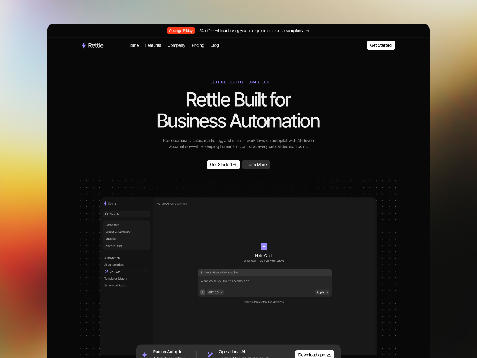
Rettle by OfScale is seven pages with a dedicated Download route plus CMS blog and legal. That page title matters when you run paid ads to /download or swap store URLs without touching the homepage hero. Weakness: the default skin reads B2B startup, so consumer lifestyle apps should budget time for a visual overhaul.
- Best for
- SaaS and mobile teams that want store links on their own route, not buried in the footer
 Live Preview
Apptly · Compare page for app positioning
by Cosmoe
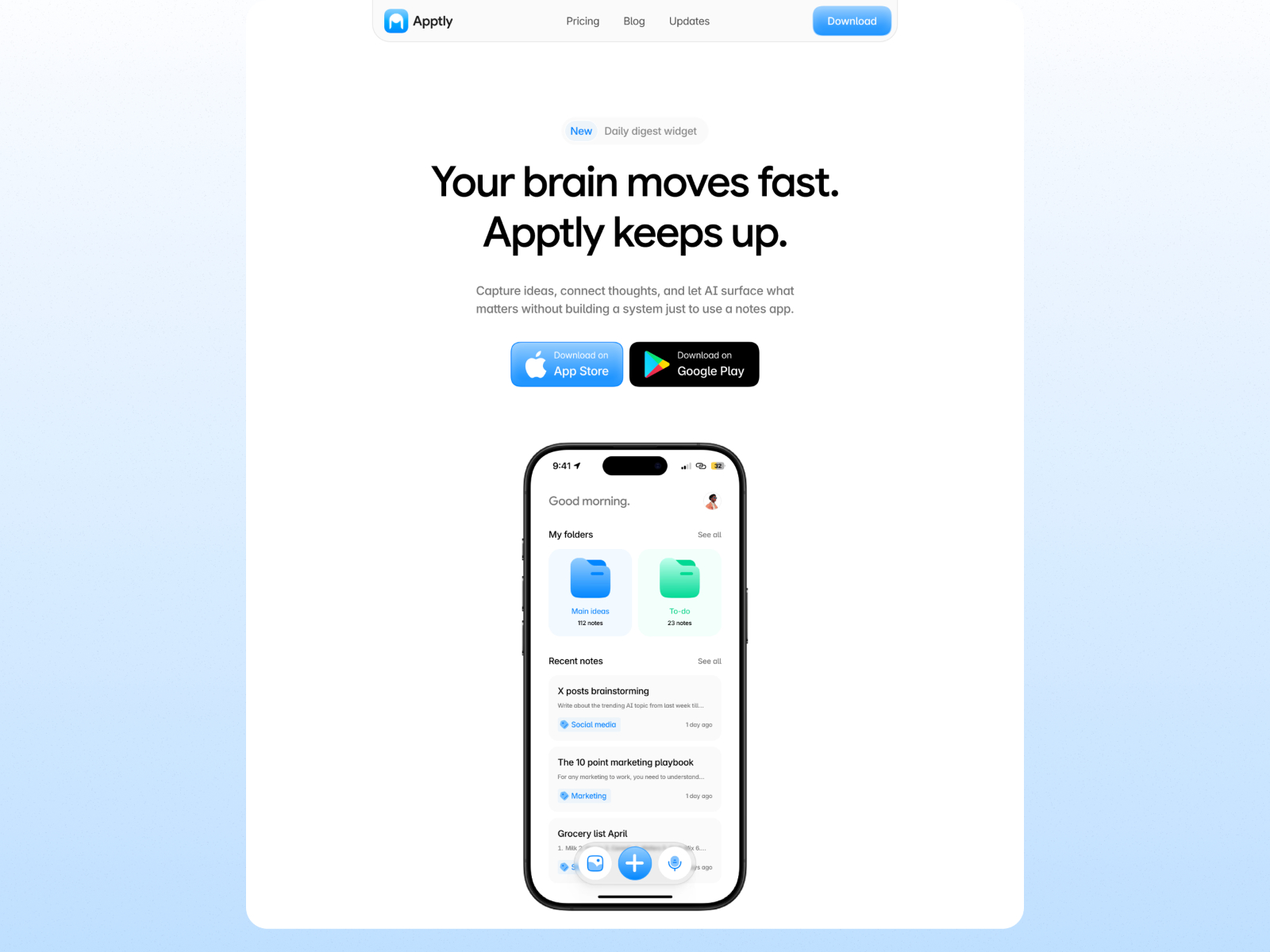
Apptly by Cosmoe packs seven routes with Compare, CMS updates, CMS blog, pricing, and legal for vibe-coded apps that still need a real marketing layer. The compare surface helps when your app competes with three incumbents and reviewers expect a side-by-side on day one. Weakness: compare and updates CMS add setup work before launch day.
- Best for
- Indie AI and productivity apps launching on Product Hunt with tiered pricing
 Live Preview
Fithub · Fitness app landing in three pages
by Pixcut
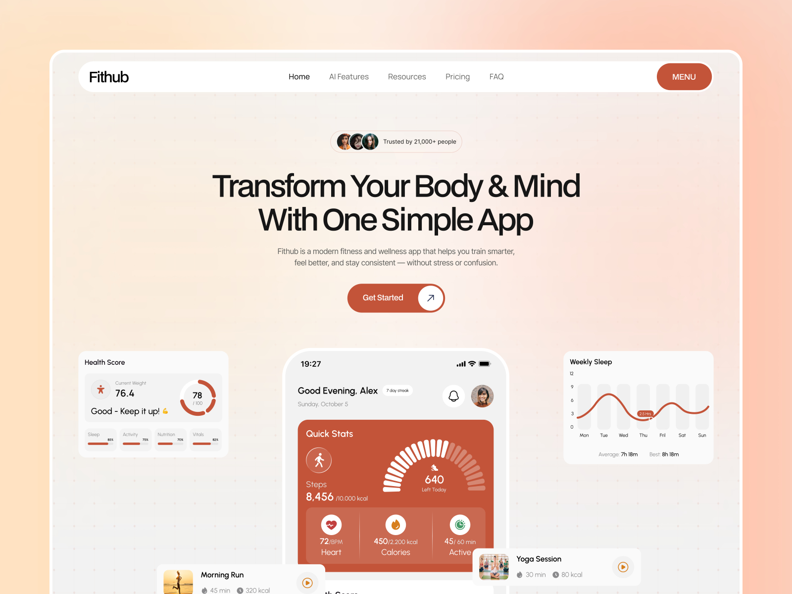
Fithub by Pixcut is a three-page App and Wellness file with home, contact, and 404. The layout assumes phone-first discovery and leaves room for app UI captures, training outcomes, and download CTAs without enterprise SaaS filler. Weakness: no pricing table or CMS blog, so subscription tiers and content marketing stay on the homepage until you add routes.
- Best for
- Workout, recovery, and wellness apps selling a mobile habit loop
 Live Preview
Focly · Dark app landing with API reference
by Gizem Onan
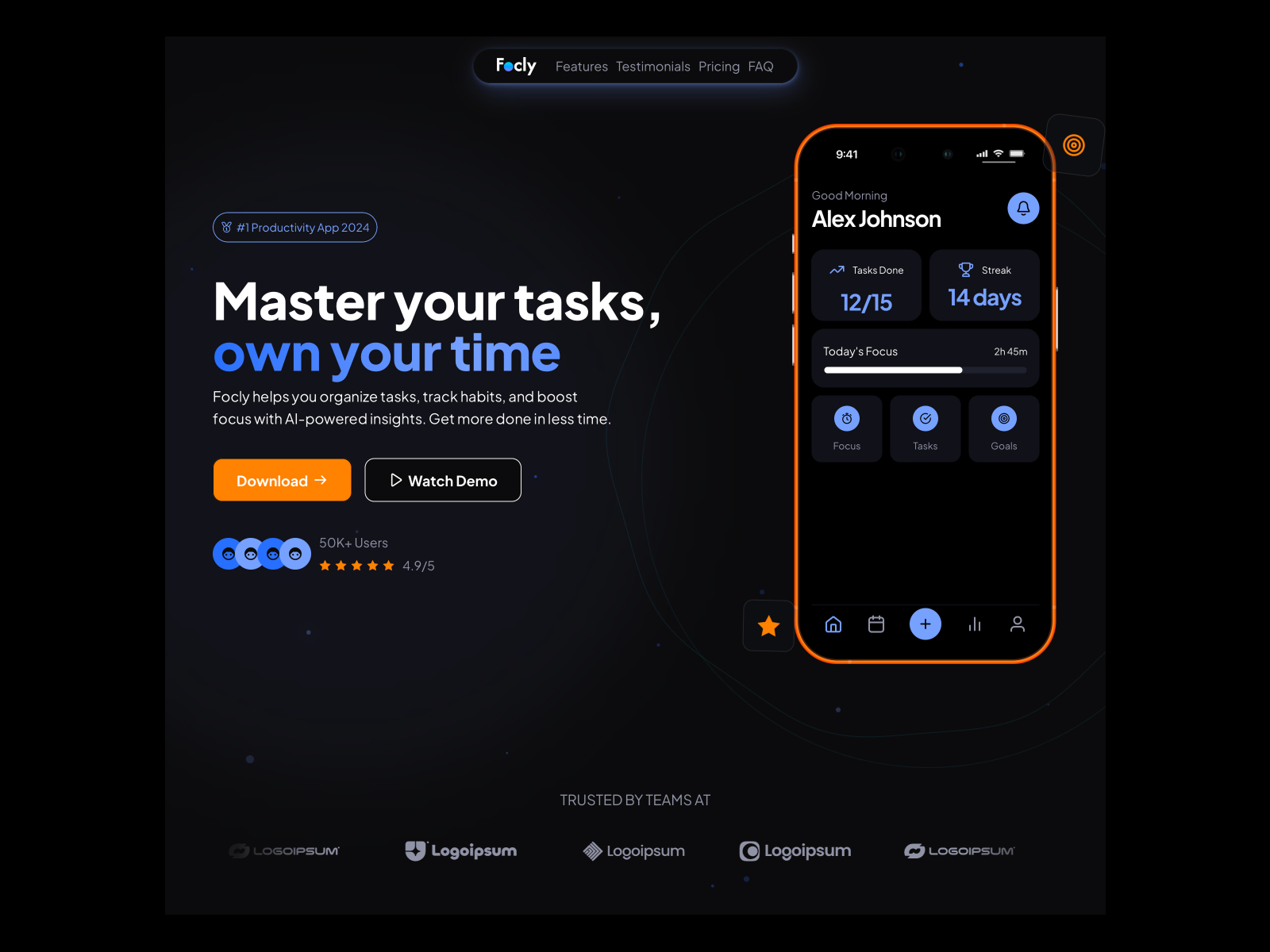
Focly by Gizem Onan is six static pages tagged App and Landing Page, including help center, careers, and API Reference alongside privacy and 404. Gradient-rich dark UI fits high-growth dev tools where technical buyers expect documentation links next to the download button. Weakness: no CMS, so API doc updates mean editing frames, not publishing entries.
- Best for
- Developer tools and B2B apps that need help center and API docs beside store badges
How to choose an app landing template
Store badges this week. Breezzy, Sofa, Fithub, and Mobile App Launch keep the map small. Two to five routes mean less copy before you wire App Store and Play Store links on the hero.
Beta before both stores. Mobile App Launch and Apptly add waitlist or updates surfaces so early users see ship cadence while review runs.
Download route plus content. Rettle and Apprise carry blog CMS and either a named Download page or changelog so post-launch marketing does not require a second remix.
Developer or fintech depth. Focly and Breezzy skew technical or payment-heavy. Match the aesthetic to your category before you fight the default palette.
Filter the template directory for more App labels, then bounce back to free Framer templates when you outgrow the download-first phase.
Our top pick for most app landing pages
If you want one default, Breezzy is the strongest free app landing Framer template in 2026 when you need a single scroll that sells a mobile product fast: App and Fintech tags, neobrutalist energy, and only two pages to customize before ads go live. Shipping an AI tool that should feel calm, not loud? Sofa is the lighter remix. Need a named Download route plus CMS blog for post-launch updates? Rettle covers both without a full site rebuild.
Across yoframer’s catalog we track 2,755 free templates as of September 2026, and only a slice tags App or ships a Download page instead of burying store links in a generic SaaS footer. Pick the smallest file that matches your launch timeline, swap in real screenshots and badge URLs, and test on mobile before you spend on traffic. When the app graduates from landing page to full marketing site, browse free Framer templates for the deeper files you will need next.