 Live Preview
← All Templates
Portfolio
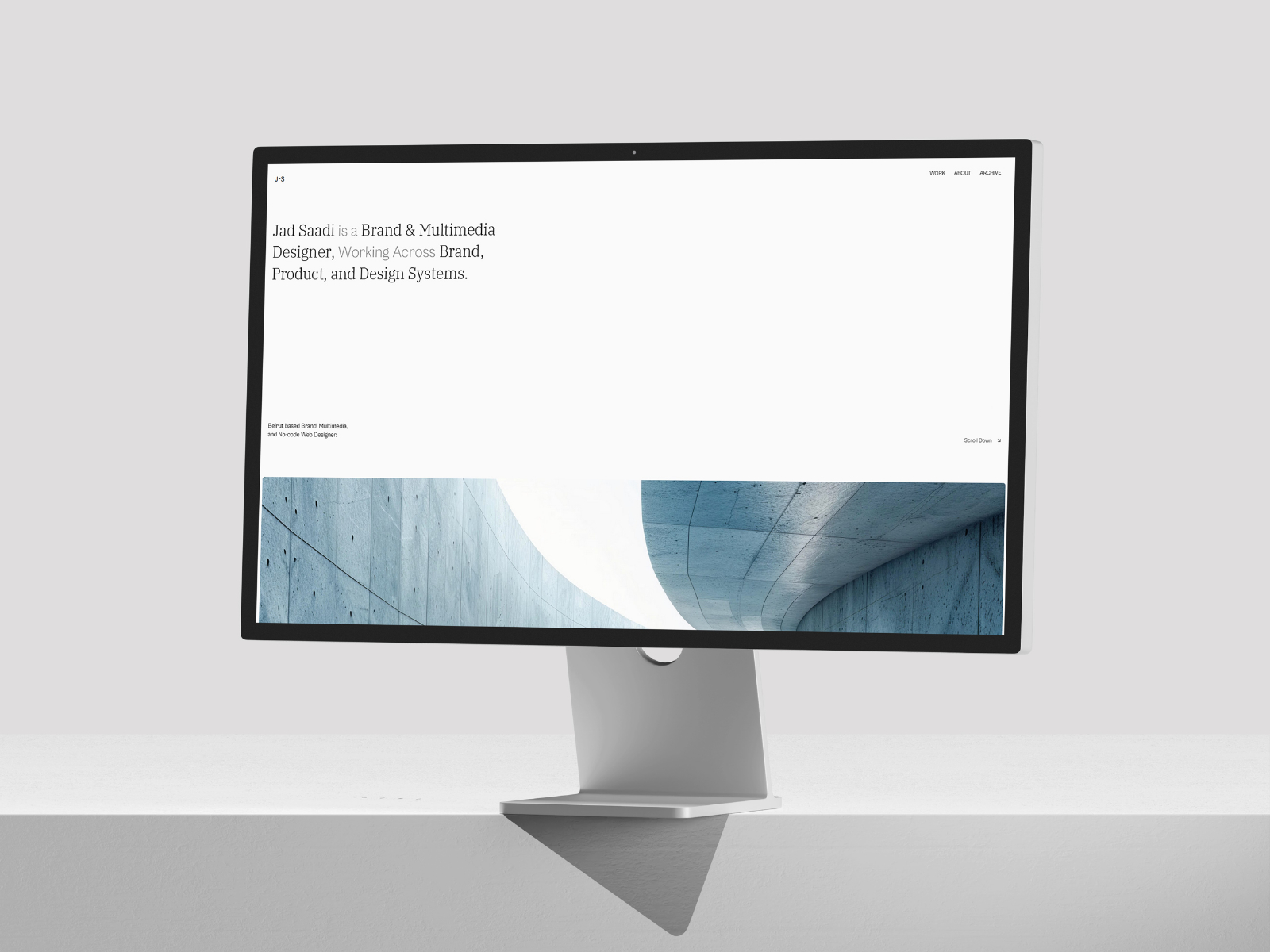
Antony — Free Designer Portfolio Framer Template
Antony is a refined Framer portfolio template built for designers who want to present case studies, visual work, and thinking in a structured, high-impact layout.
portfoliodesignercase-studyblogfree
Antony is a free Framer template from WebTem aimed at teams and independents who need a credible web presence without rebuilding layout primitives from scratch. The structure favors structured case studies plus a classic blog flow, so you spend time on copy, photography, and offer specifics instead of grid experiments. You still get enough sections to explain what you do, who it is for, and what happens after someone raises their hand.
Who Is Antony For?
If your work maps to the Portfolio lane on our directory, this file is meant to accelerate a launch that still feels bespoke. Founders, studio leads, and freelancers who want a coherent narrative across multiple pages will get the most mileage, especially when you need repeatable case study and blog layouts you can duplicate or later connect to Framer CMS if you choose. That matters when you are iterating weekly: you want the layout stable while the words and media change.
Use it when you need a credible site for outbound, ads, or partner referrals, and you do not have bandwidth to design every breakpoint from zero. The page map mirrors how buyers actually browse, which reduces the blank-page problem that slows many first launches.
It is less ideal if you need a highly custom app shell, authenticated dashboards, or a headless stack outside Framer. In those cases, treat this as a marketing layer and plan a separate product surface. It is also the wrong starting point if you want an experimental microsite with almost no text: this template assumes you will explain value in sentences, not only in visuals.
Design Style
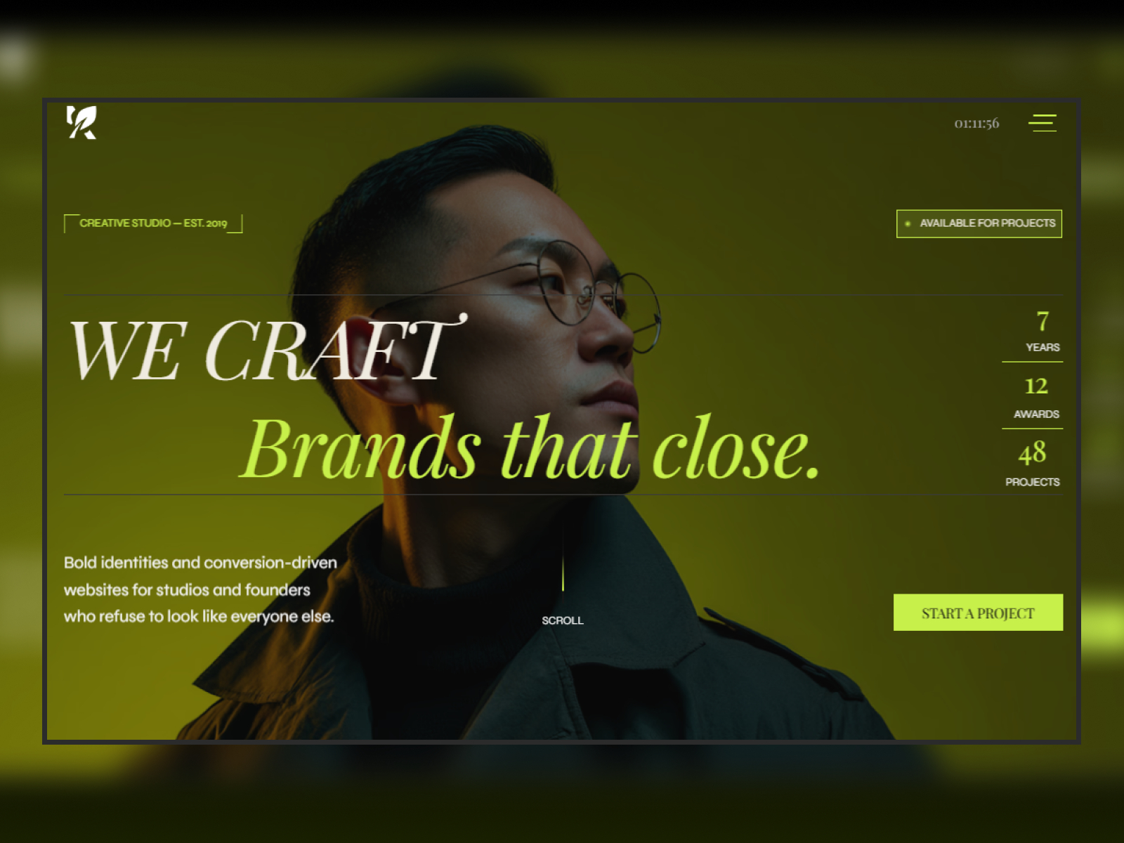
The preview reads as a modern marketing site: confident type, generous whitespace where it helps scanning, and section rhythm tuned for conversion rather than novelty for its own sake. Motion and interaction should feel supportive, keeping attention on headlines, proof, and calls to action rather than distracting from the offer.
Visually, it sits in the same territory as contemporary SaaS and studio sites you see in the wild: polished enough for outbound links, restrained enough that your photography and product shots remain the hero. If you tune color and type to match your brand system, the underlying spacing and hierarchy should still read intentional rather than generic.
What’s Included — 8 Pages
- Home — Primary entry point with hero, positioning, and main conversion path.
- About — Team story, values, and credibility signals for visitors comparing vendors.
- Case study — Project or case study surface to show process and outcomes.
- Case study details — Long-form layout for a single project narrative, proof, and outcomes.
- Blog details — Single-post layout for articles and notes alongside the main blog index.
- Contact — Lead capture and contact routes for inquiries and bookings.
- Blog — Editorial index for updates, guides, and organic search depth.
- 404 — Branded error page for broken links and outdated campaigns.
Together these routes cover the usual buyer journey from discovery through trust and contact, with clear homes for both shallow and deep storytelling. Even if you do not ship every page on day one, the routes give you a sensible backlog so the project does not collapse the moment someone asks for a privacy page, a single case study, or a blog entry.
Key Features
Structured page types for case studies and posts give you repeatable frames you can duplicate or wire to CMS when you are ready, which matters when stakeholders email you new copy every week. Forms support lead capture on contact and booking routes. Animations add polish without forcing you to hand-code every interaction. Responsive layouts keep the story intact on phones, where a large share of first visits still lands. SEO-oriented structure gives you a sane baseline for metadata and headings as you refine keywords. Accessibility-minded defaults help you avoid shipping a layout that looks premium but reads poorly with assistive tech.
Why We Recommend It
At free pricing, Antony is a practical way to test positioning, run a campaign, or stand up a client microsite quickly while keeping production quality high. WebTem has packaged the marketplace feature set into a route map that matches how real projects evolve, which saves you from inventing information architecture while you are still figuring out the offer.
If you want a complete multi-page Framer starting point with clear editorial and conversion paths, remix it, swap the visuals, tighten the copy, and ship. When you outgrow the defaults, you can extend components and collections without throwing away the whole system.
Frequently Asked Questions
Quick answers about Antony — Free Designer Portfolio Framer Template, including pricing, CMS support, responsiveness, and who it is built for.
- What kind of website is Antony — Free Designer Portfolio Framer Template best for?
- Antony — Free Designer Portfolio Framer Template is best for portfolio websites and related projects that need a polished Framer starting point.
- Is Antony — Free Designer Portfolio Framer Template free or paid?
- Antony — Free Designer Portfolio Framer Template is a free Framer template. The listed price on yoframer is free.
- Does Antony — Free Designer Portfolio Framer Template support CMS and responsive design?
- Antony — Free Designer Portfolio Framer Template does not include CMS support and is fully responsive.
- Who created Antony — Free Designer Portfolio Framer Template and what is included?
- Antony — Free Designer Portfolio Framer Template was created by WebTem. It includes 8 pages: Home, About, Case study, Case study details, Blog details, Contact, Blog, 404. You can also review the live preview before remixing it.
Featured in our Portfolio roundup
20 Best Portfolio Framer Templates in 2026 (Ranked)
A portfolio site should show work first and make contact inevitable. These 20 Framer templates cover minimal one-pagers to full CMS studios.