 Live Preview
Revenue — Free SaaS Template for Framer
by Unknown
Kori is a free one-page startup Framer template for a budget or finance app landing with proof blocks on Home. Skip it if you need Pricing as its own URL. Shiftium adds routes.
Kori is a free one-page startup template for Framer aimed at a budget or personal finance app pitch. Framer lists a single Home route, no CMS, so the whole story lives on one scroll with hero, feature bands, social proof, and download CTAs. Skip it if investors or app review policies require standalone Pricing, Changelog, or Terms URLs in the header. Shiftium adds those pages without collections. More free Framer templates sit on the hub, or start with the one-page shortlist.
Kori fits a solo founder or two-person team launching a consumer finance or budgeting app before the product is fully public. You already have app screenshots, a clear value prop, and one primary CTA toward TestFlight or the Play Store. One Home page means you are not maintaining nav links that would stay empty for months. Designers pitching a fintech MVP to accelerators also move faster here than on a twelve-page corporate file.
Walk away if your go-to-market plan includes a public pricing page, release notes, or a support contact route that must not live in the footer only. Kori cannot deep-link to Pricing because it does not exist as a frame. Walk away if you need CMS blog posts for SEO velocity. There is no blog index. For a richer one-scroll SaaS layout with pricing sections baked into Home, compare Growiq before you commit.
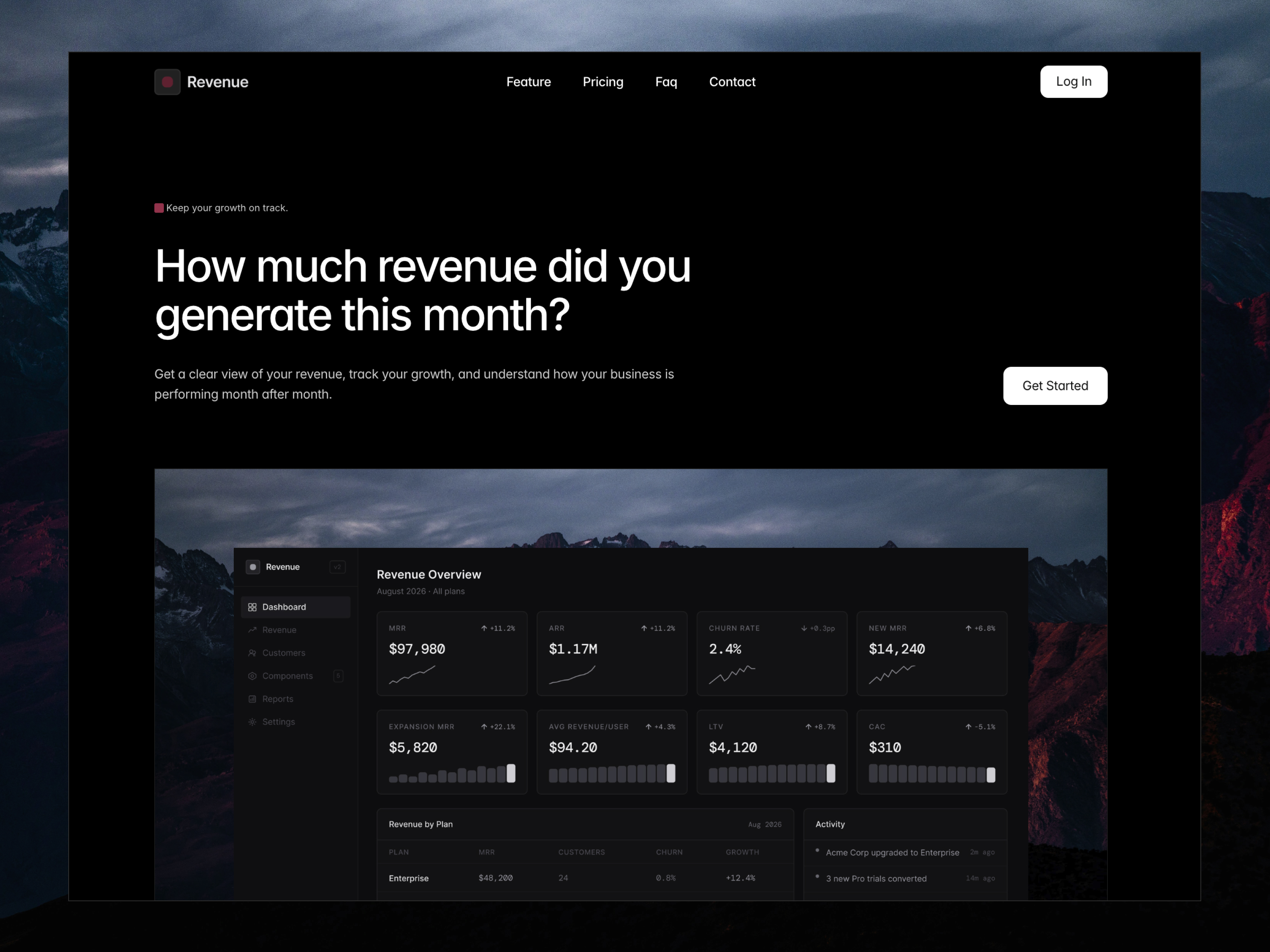
The preview skews friendly fintech: soft neutrals or pastel accents, rounded UI cards that echo mobile app chrome, and typography sized for quick phone reading. Hero space favors device mockups and short headline stacks, not long agency manifestos. Illustration and iconography lean approachable, which suits budgeting tools targeting everyday spenders rather than enterprise treasury teams.
Scroll rhythm is linear: problem, product shots, benefits, testimonials or stats, then store badges or waitlist capture. Motion is light so Lighthouse scores stay reasonable on mobile data. The trade-off is depth. A brand that wants dark, institutional wealth management drama will replace photography and color tokens because the default mood reads consumer and optimistic.
One page, named as Framer lists it:
Every other route you need later is a new page you add after remix, not something bundled in the marketplace list.
Platform SEO, analytics, and responsive breakpoints come with Framer. They are not differentiators for Kori specifically.
Remix Kori when you need a credible app landing this week and you are fine keeping pricing, changelog, and policies inside one scroll or adding pages later. It rewards teams with sharp copy and real screenshots more than teams with a ten-page sitemap checklist.
Skip it when marketing needs named Pricing and Changelog routes before launch. That is Shiftium. Skip it when you want a louder SaaS pricing block on a one-pager with more sections. Compare Growiq. Still browsing? Return to the one-page shortlist or the free Framer templates hub.
Quick answers about Kori, including pricing, CMS support, responsiveness, and who it is built for.

Startup sites need a credible story, legal pages when buyers ask, and room to grow. These 20 Framer templates cover pre-launch to Series A marketing depth.