TL;DR — Framer shipped a canvas-focused layout release (official notes) centered on Grid and Stack ergonomics. Headline additions include Bento Grid layouts, freeform sorting inside Stacks, and placeholders that keep the original frame from collapsing when you drag items between Stacks. Image dragging inside Stacks and Grids is faster, the Layout menu’s Stack entry is simpler, and a wide set of grid, ticker, and toolbar bugs were closed. If you live in layout-heavy marketing pages, this is one of the most tactile Framer editor upgrades in recent cycles.
Framer’s own post is the source of truth for every line in the changelog below — this article adds context for working designers: what to try first, where the friction used to be, and how to fold Bento into a real project without overbuilding the first hero.
Layout tooling at a glance
| Area | What changed | Why it matters on real sites |
|---|---|---|
| Grids | Bento-style grid support | Faster build-out of uneven tile heroes, feature bands, and dashboard-style marketing sections |
| Stacks | Freeform sorting + reliable placeholders | Reordering and moving items between Stacks without the layout snapping shut behind you |
| Images | Faster drag operations in Stacks and Grids | Less hesitation when you are shuffling gallery or logo rows during a polish pass |
| Layout menu | Clearer Stack tool entry | Fewer wrong clicks when you are jumping between Stack and Grid modes |
| CMS | Better search for CMS pages on Canvas | Less hunting when a project carries dozens of CMS-driven routes |
| A11y | Date fields use a semantic time element | Cleaner semantics for blogs, changelogs, and event modules |
Watch Framer’s layout update walkthrough
Framer’s official update post links this walkthrough video — embedded here so you can follow along without leaving yoframer.
Bento grids, Stack sorting, and related layout improvements
1. Bento Grid layouts
“Bento” has become shorthand for asymmetric tile layouts — one tall cell beside two short ones, a wide strip under a tight cluster, and so on. Framer extends Grid tooling in this release so those patterns are first-class instead of something you fake with nested frames and manual spans.
If you ship SaaS marketing sites, product update pages, or dense agency homepages, you will feel this most in the first screen below the hero, where teams usually burn hours nudging breakpoints.
2. Freeform Stack sorting and steadier placeholders
Sorting layers and images inside Stacks is smoother, and you can move items freely between Stacks without the donor layout imploding. Framer now leaves a fixed placeholder where the item came from, which keeps spacing honest while you experiment.
That sounds small until you have tried to reorganize a component library section or a partner-logo row across two Stacks — the old collapse behavior was the kind of detail that trained people to duplicate frames instead of rearranging them.
3. Image dragging and Grid reliability
Moving images inside any Stack or Grid is noticeably quicker. On the fix side, Framer addressed nested grid collapse, masonry grid collapse, image flash while sorting in grids, and a frustrating case where images showed Fill while behaving like Fit.
Together, those fixes target the “it looked fine until I touched it” class of bugs — the ones that make stakeholders nervous during live reviews.
4. Layout menu, CMS search, and accessibility polish
The Layout menu now presents a simpler Stack tool, which reduces friction when you are switching modes all day. CMS page search on Canvas is improved for large projects. Date fields now use a proper <time> element for accessibility — a welcome alignment with how blogs and changelogs should expose machine-readable dates.
5. Everything else in one pass
Framer also shipped fixes for ticker layer sorting flicker, path handles when holding Shift, dynamic filters keeping query params, toolbar focus states getting stuck, preview surfacing when unavailable, component menu icons, Stack-to-Grid conversion collapse, Decoration copy and paste, emoji rendering in the desktop app, file input close buttons, and more. Treat Framer’s official list as authoritative if you are chasing a specific bug ID.
Layout changelog, annotated
| Type | Change (paraphrased) | Why designers care |
|---|---|---|
| Added | Bento-style support in Grids | Less scaffolding for modern marketing layouts |
| Added | Freeform Stack sorting | Reorder without fighting the layout engine |
| Added | More reliable Stack placeholders | Safer moves between Stacks |
| Improved | Layout menu / Stack tool clarity | Faster mode switching |
| Improved | CMS page search on Canvas | Easier navigation in CMS-heavy projects |
| Improved | Image drag performance | Snappier gallery and grid edits |
| Improved | Date field accessibility (time) | Better semantics for editorial content |
| Fixed | Nested grid and masonry collapse | Fewer “why did this shrink?” moments |
| Fixed | Ticker sorting flash, grid image flash | Cleaner motion while editing |
| Fixed | Grid images showing wrong fit mode | What you see matches how images behave |
| Fixed | Path handles with Shift held | More predictable vector edits |
| Fixed | Dynamic filters dropping query params | Fewer broken filtered URLs after publish |
How to use Bento grids and the new Stack behavior
You do not need a beta flag — update Framer, open any project, and work on the canvas like usual. Framer’s official release notes link a video walkthrough if you prefer to watch the UI once before clicking around.
60-second checklist
- Drop or select a Grid on the canvas.
- Explore the Grid / Bento controls Framer added in this release — build one uneven row and preview desktop and mobile.
- Create two Stacks with a few images or components.
- Drag an item from Stack A to Stack B and confirm the placeholder holds the gap in Stack A.
- Shuffle images inside a dense Grid and confirm drag feels immediate — if you had a bugged file before, retest it here.
If you are new to Framer entirely, start free on Framer and remix a layout-heavy template from the picks below so you are not designing bento tiles inside an empty project.
Three workflow recipes to try this week
Ship a bento feature band in one sitting
You need a homepage section with three uneven tiles — product shot, copy, metrics — without nesting five manual frames.
- Sketch the tile ratios on paper for one breakpoint so you are not guessing in the inspector.
- Use the new Bento-friendly Grid options to assign spans; lock desktop first, then tighten tablet and phone.
- Drop real content, not placeholders — bento layouts fail when every cell is lorem ipsum of the same length.
Move components between Stacks without collateral damage
You are reorganizing a long landing page and want to pull a testimonial strip from one Stack into another without reflowing the whole page.
- Duplicate the page to a scratch frame if stakeholders are watching — same as always.
- Drag the testimonial block across Stacks and watch the donor Stack hold a placeholder instead of snapping shut.
- Trim or swap the placeholder once the destination Stack spacing looks right.
Polish a logo or press grid under time pressure
You have fifteen raster logos in a Grid and the client just sent a new SVG that must sit third in the row.
- Insert the new asset directly into the Grid cell you care about.
- Drag-sort the row — this release specifically targets faster image moves and flashing while sorting.
- Double-check Fit vs Fill on the worst-behaving raster — the Fill-versus-Fit mismatch called out in the release notes was a real foot-gun before this patch.
Who benefits most
- Marketing site builders shipping uneven tile sections and dense feature grids.
- Agency teams handing off pages where juniors reorder Stacks constantly.
- Portfolio designers with image-heavy grids who felt sorting was “flashy” or fragile.
- CMS-heavy projects where finding the right CMS page from the canvas used to feel slow.
Framer templates that reward ambitious layouts
These picks skew layout-first — good sandboxes for Bento grids, long scroll storytelling, and multi-section agency pages. Browse the full yoframer template directory when you want more niches.
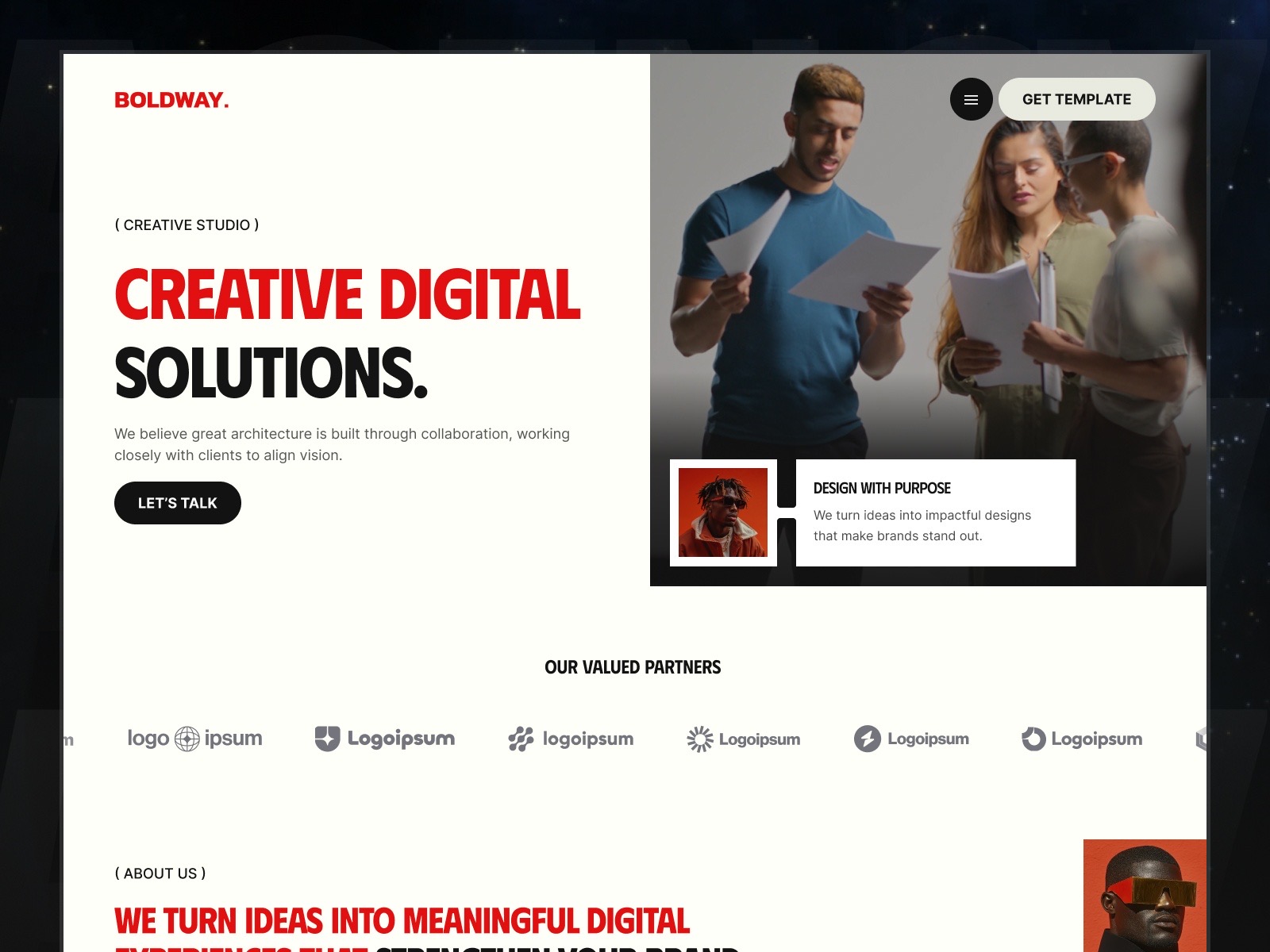
Boldway — Twelve routes of bold agency layout
by Flowzai
Boldway is built for confident, large-type agency work — exactly the kind of site where new Grid modes and Stack stability save the most time. Remix it when you want real pages, not a blank canvas, before you stress-test Bento.
- Best for
- Creative shops that need loud grids, portfolio depth, and CMS-backed case studies in one file
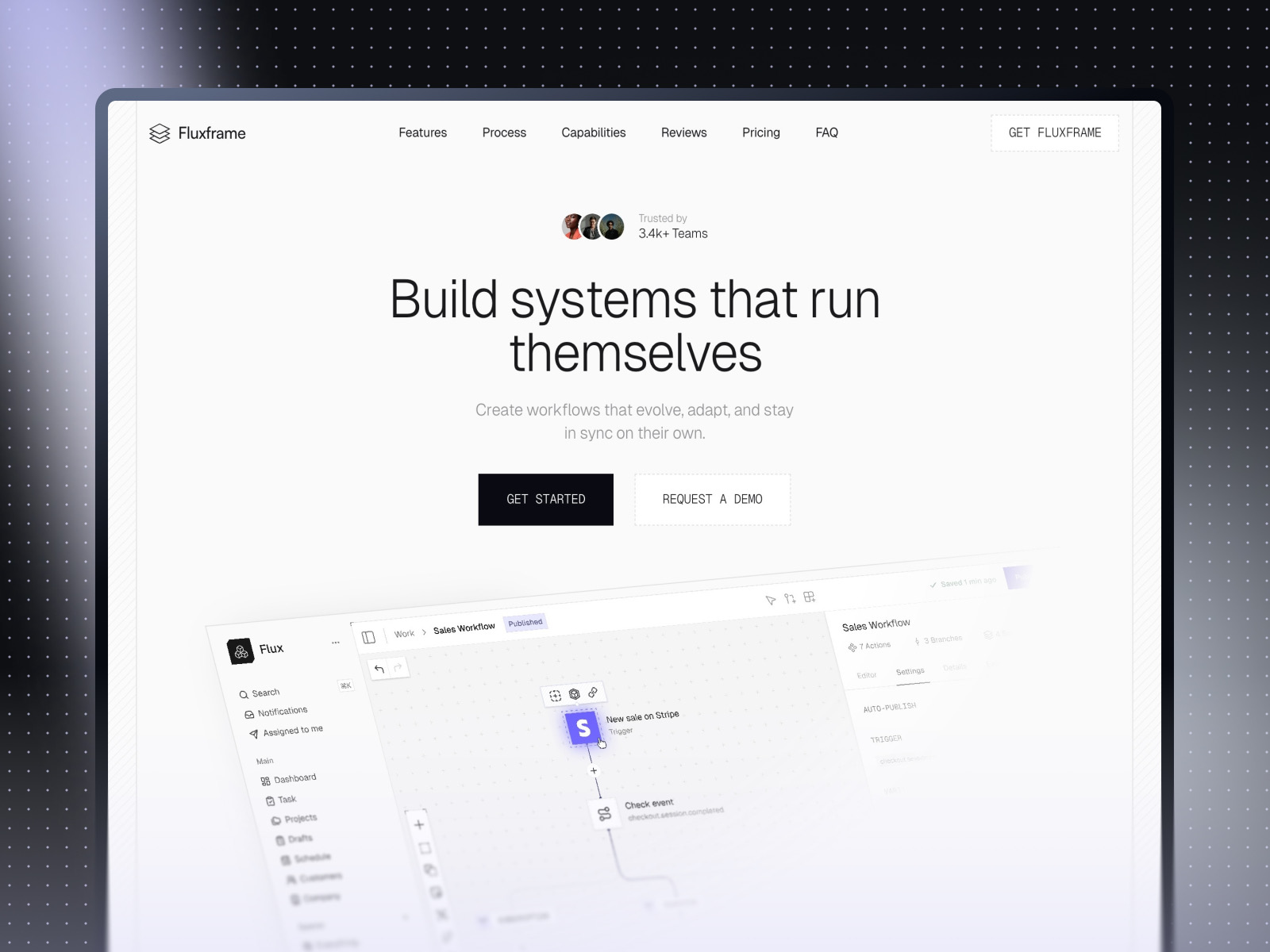
Fluxframe — Two-page SaaS landing with motion-forward layout
by Brice Deguigne
Fluxframe keeps scope tight — Home plus 404 — so you can focus on how sections stack, pin, and animate. It is a strong place to feel whether your new grid work reads cleanly under scroll-driven motion.
- Best for
- Product teams that need a scroll story with animated feature bands instead of a sprawling sitemap
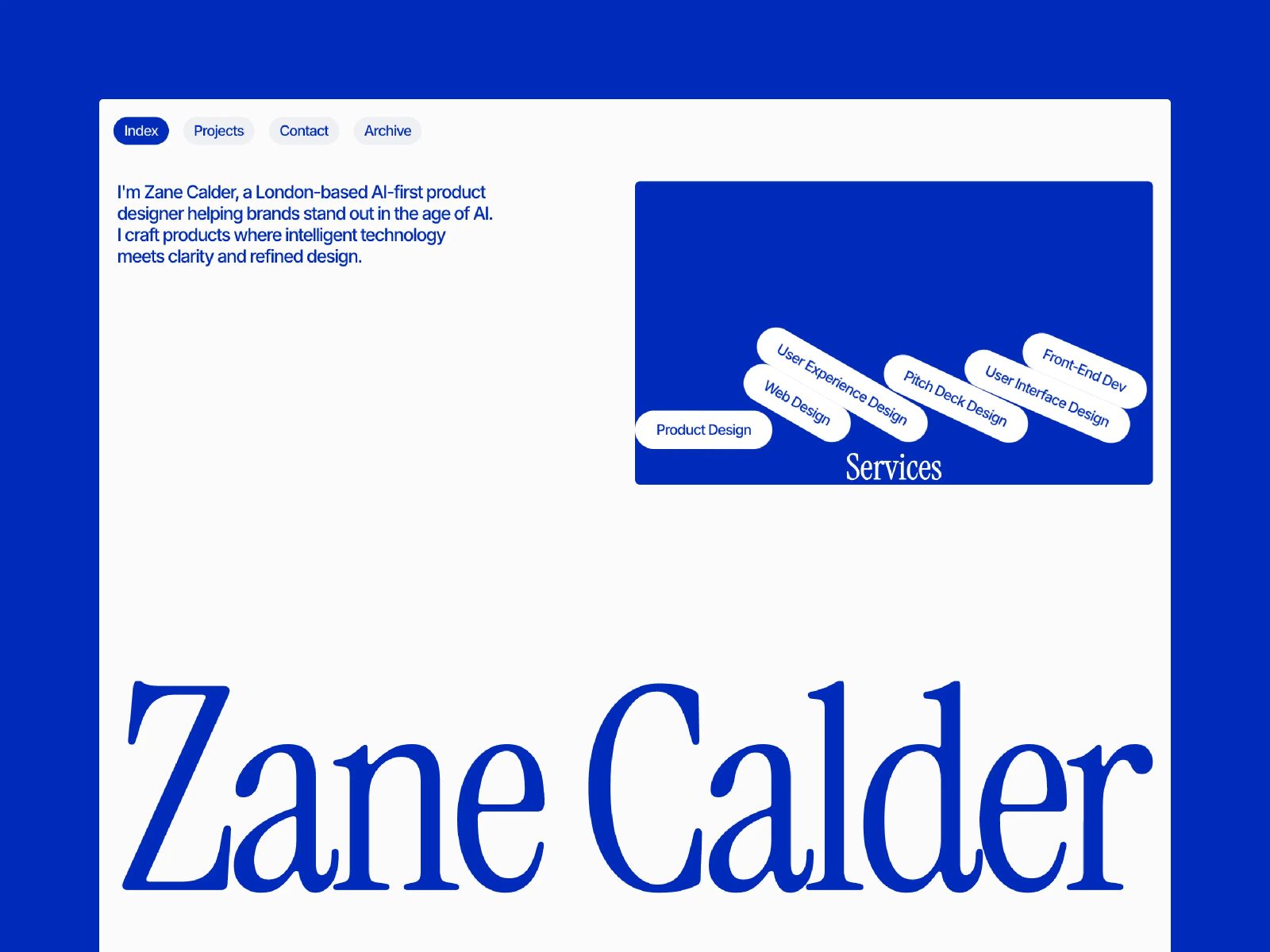
Calder — Portfolio grid discipline with CMS depth
by Chayan Panda
Calder emphasizes grid discipline on browse and detail routes. If you want to see how Bento and Stack polish interact with CMS-backed case studies, start here.
- Best for
- Creatives who need structured project browsing and archive pages without enterprise bloat
For more curated sets, browse Framer template roundups — the best free SaaS Framer templates in 2026 and best agency Framer templates in 2026 lists are good follow-ons.
Official Framer resources worth bookmarking
- Official Framer release notes — Bento and layout tools — canonical changelog and narrative.
- Framer on YouTube — layout walkthrough — quick visual pass on the new layout tools.
- All Framer updates — everything else shipping around the same window.
- Developers changelog — API- and code-facing changes alongside editor releases.
More reading on yoframer
- Framer updates hub — editorial coverage of each major Framer release.
- Resources directory — components, plugins, kits, and tutorials.
- Submit a template or resource — if you ship something that shows off great grid work.
The bottom line
This batch of work is not a new animation system or a CMS rewrite — it is the kind of release that makes the canvas feel less brittle when you are deep in layout. Bento grids, calmer Stacks, faster image moves, and the grid collapse fixes address the work designers repeat dozens of times per project.
Open a current client file this week, rebuild one stubborn section with the new Grid options, and drag a few assets between Stacks on purpose. If the placeholder behavior has ever saved you from a layout collapse, you will know immediately why this release matters.