SaaS dashboards, pricing pages, and product tours all depend on the same micro-interaction: a framer tooltip component that reveals context without breaking layout or trapping the cursor. Native Framer variants can fake a hover label, but they rarely auto-flip at viewport edges, stay keyboard-accessible, or survive a scroll without flicker.
This list ranks eight tooltip and hover-info components on the Framer marketplace in 2026. Every pick has a live listing, identifiable creator, and working preview — one free and seven paid, spanning smart positioning, cursor-following hints, rich onboarding popups, inline dictionary definitions, avatar stacks, pulse markers, and image hotspots.
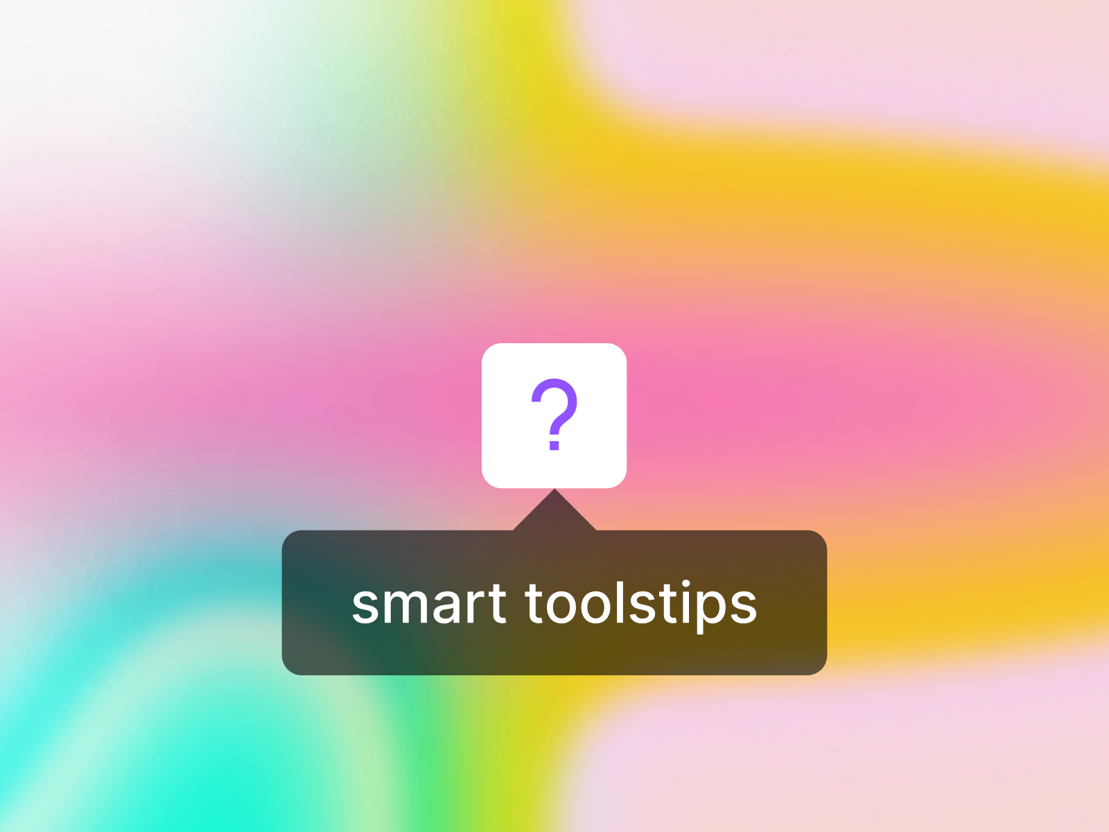
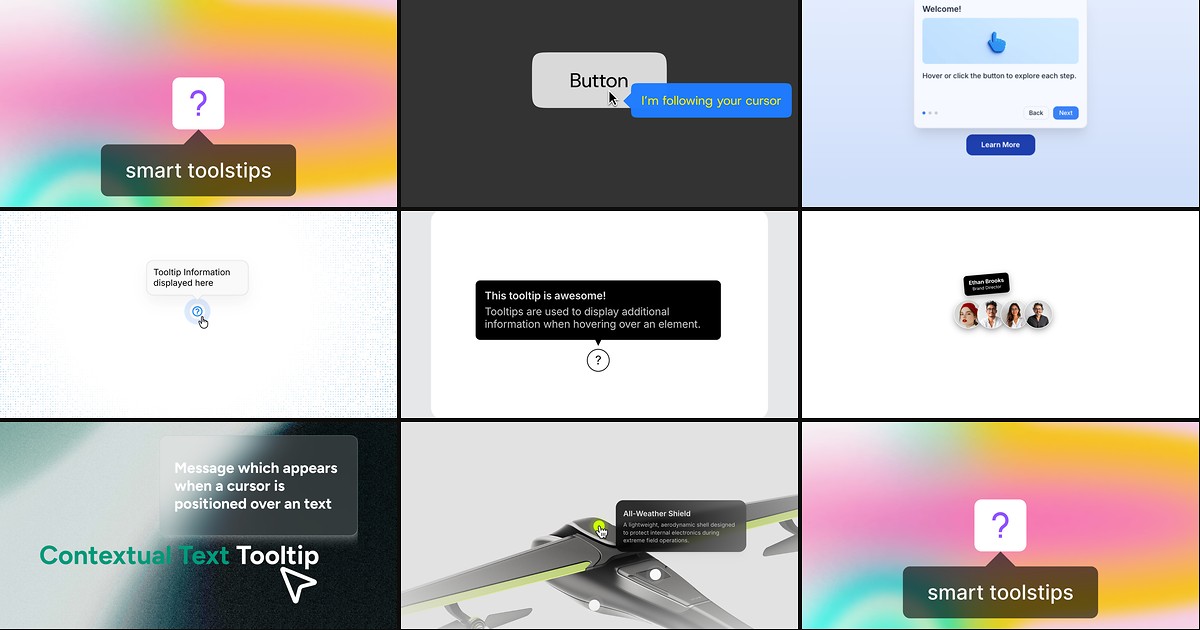
Smart Tooltips — Smart positioning, click-to-pin, and live canvas preview
Smart Tooltips is the strongest free starting point on this list: Lennart Ahlfeldt built edge-aware repositioning so preferred bottom or right placement automatically flips to top or left before the bubble clips off-screen. Hover reveals the tooltip, click pins it for longer copy, and outside-click plus scroll dismiss keep the interaction predictable. Deep controls cover trigger icons, bubble shadows, max width, and a canvas preview toggle so you can style without constantly switching to present mode — the default install when you need one polished tooltip system across an entire Framer site.
- Best for
- Form labels, nav hints, and help icons where edge-aware placement and accessibility matter
Affiliate link — we may earn a commission at no extra cost to you.
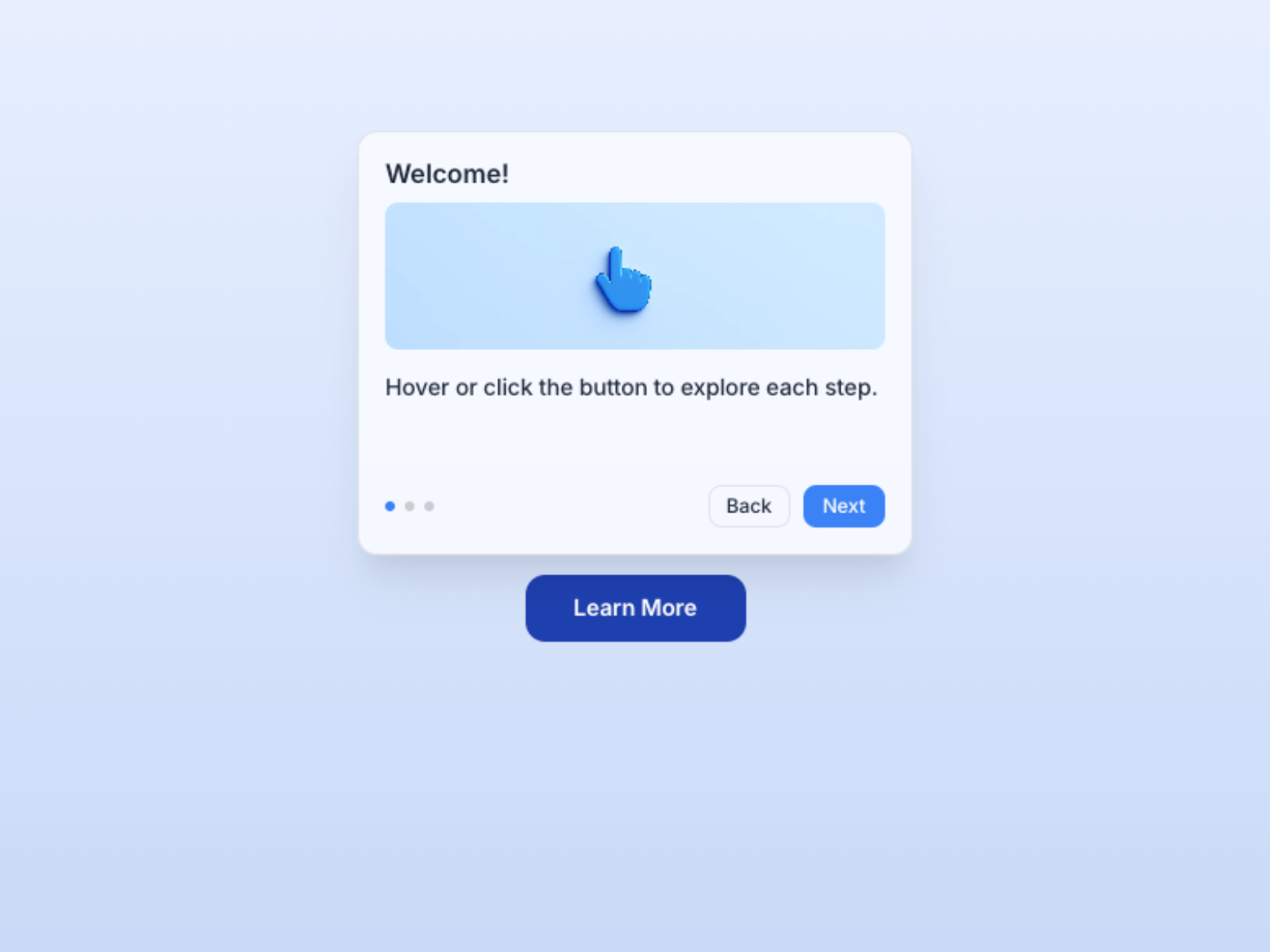
Smart Tooltip Popup — Rich popup cards with media, CTAs, and multi-step walkthroughs
Smart Tooltip Popup upgrades the tooltip pattern into a mini card — titles, body copy, images, buttons, and multi-step sequences triggered by hover or click. John Valentine added spotlight dimming, position controls, and adjustable show/hide delays so walkthroughs feel deliberate rather than twitchy. At 7 USD it is the pick when your tooltip brief is closer to an onboarding step than a form asterisk — ideal for SaaS homepages that need contextual feature reveals without building a separate modal stack.
- Best for
- Product onboarding tours and feature highlights that need more than a one-line hint
Affiliate link — we may earn a commission at no extra cost to you.
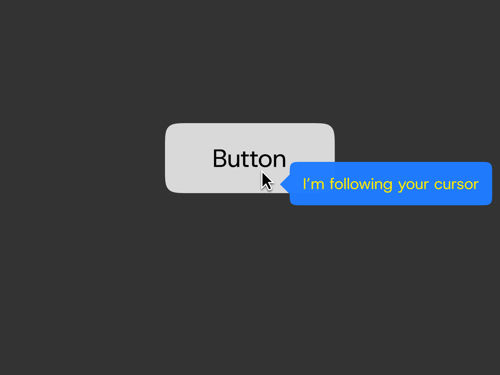
Cursor Tooltip — Tippy.js cursor-following tooltips with blur and smart placement
Cursor Tooltip wraps Tippy.js for Framer builders who want the label to follow the pointer instead of anchoring to a static trigger box. Artem Kostenko exposes auto placement against viewport edges, optional arrow pointers, backdrop blur on the bubble, and a configurable hover area that can double as an underlined link. At 1 USD it delivers the highest interaction polish per dollar on this list — perfect when a portfolio or docs page needs cursor-adjacent hints on sparse layouts without rebuilding tooltip physics in code overrides.
- Best for
- Editorial links and hero CTAs where the hint should track the pointer
Affiliate link — we may earn a commission at no extra cost to you.
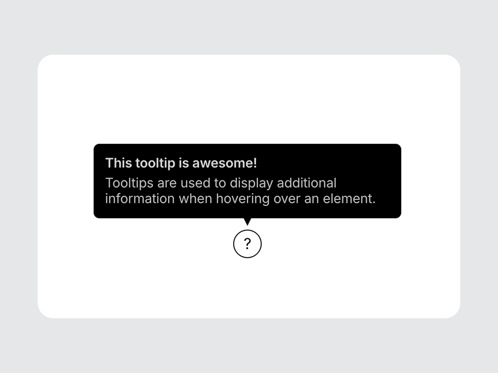
Premium Tooltip — Eight placement modes with arrow, border, and shadow controls
by Chaman Verma
Premium Tooltip from Chaman Verma targets the classic UI-hint use case — icon buttons, compact nav items, and inline help glyphs — with eight placement options and precise arrow alignment. Padding, border style, shadow, font, and icon visibility all route through Framer’s native style controls, so the bubble matches existing color styles instead of fighting them. At 8 USD it is the professional default when Smart Tooltips free tier is enough functionally but the client expects a tighter, brand-controlled tooltip shell across dozens of triggers.
- Best for
- Design-system-heavy sites that need pixel-aligned UI hints on icons and buttons
Affiliate link — we may earn a commission at no extra cost to you.
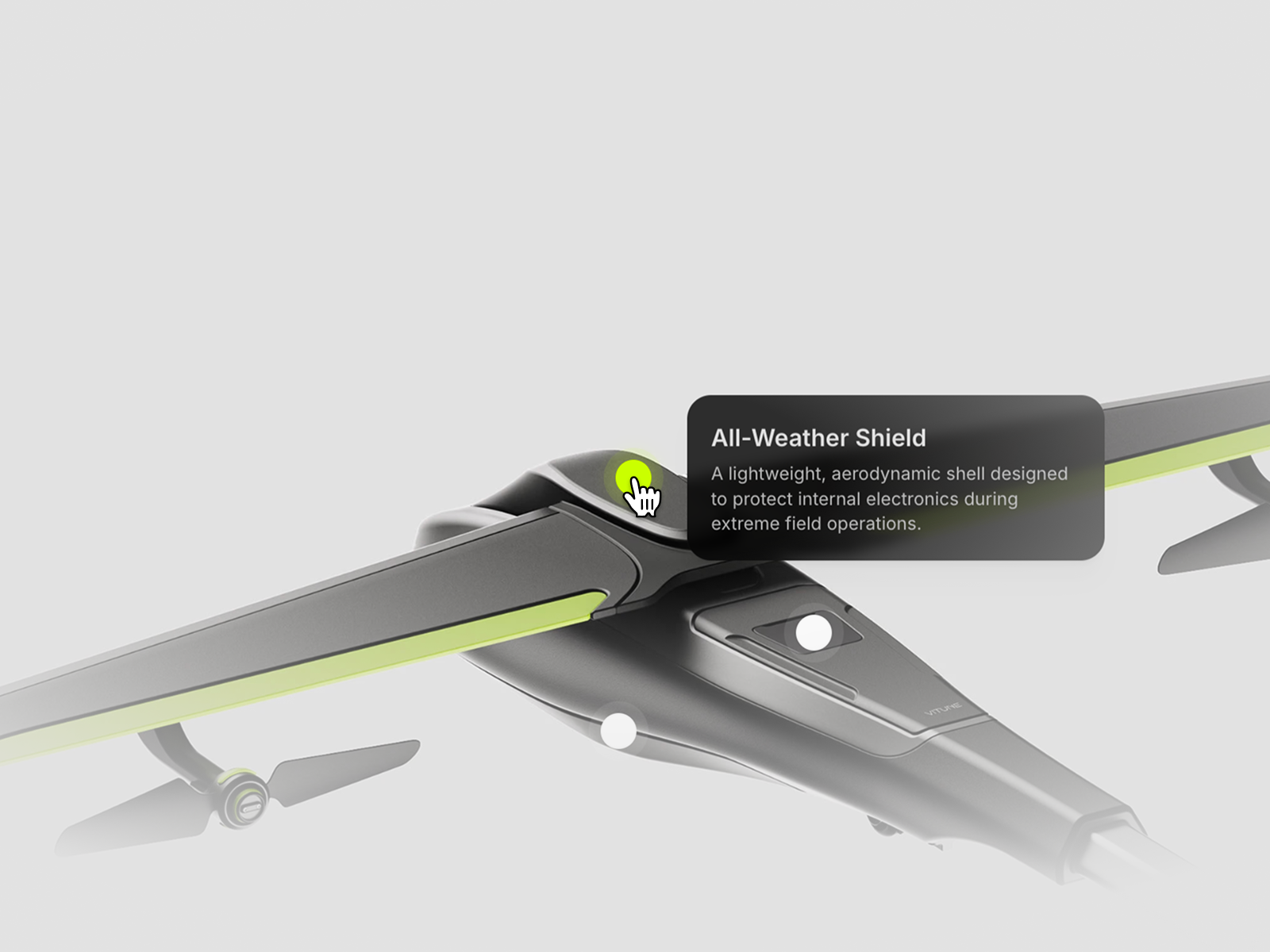
Interactive Hotspot — Percentage-anchored markers with hover-revealed spec tooltips on images
by Ahmed Walid
Interactive Hotspot turns flat product photography into an explorable spec sheet — Ahmed Walid lets you pin minimalist animated markers with percentage-based coordinates that stay locked across breakpoints. Hover triggers scale-and-fade tooltip panels powered by Framer Motion, with light and dark styling and canvas-level access to the main component for layout tweaks. At 6 USD it wins when the tooltip is not beside a button but on top of a hero render — camera lenses, furniture details, or hardware close-ups that need spatial context ordinary hover labels cannot provide.
- Best for
- Product renders, e-commerce detail shots, and technical showcases with callout specs
Affiliate link — we may earn a commission at no extra cost to you.
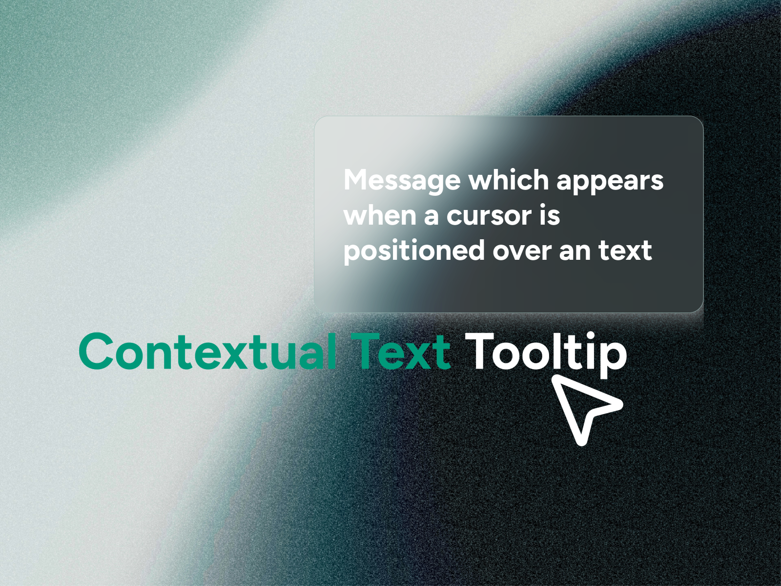
Contextual Text — Inline dictionary highlights with glassmorphic definition tooltips
Contextual Text from Evixel Studio scans body copy for dictionary matches, highlights the first occurrence of each term, and reveals a frosted-glass definition tooltip that follows the cursor with viewport-aware repositioning. Control highlight color, underline style, tooltip blur, max width, and scroll behavior for longer definitions directly from the property panel. At 7 USD it is the specialized pick when tooltips belong inside paragraphs rather than beside icons — investor memos, API docs, and education landers where readers expect hover definitions without leaving the sentence flow.
- Best for
- Documentation, glossaries, and editorial pages with jargon that needs inline definitions
Affiliate link — we may earn a commission at no extra cost to you.
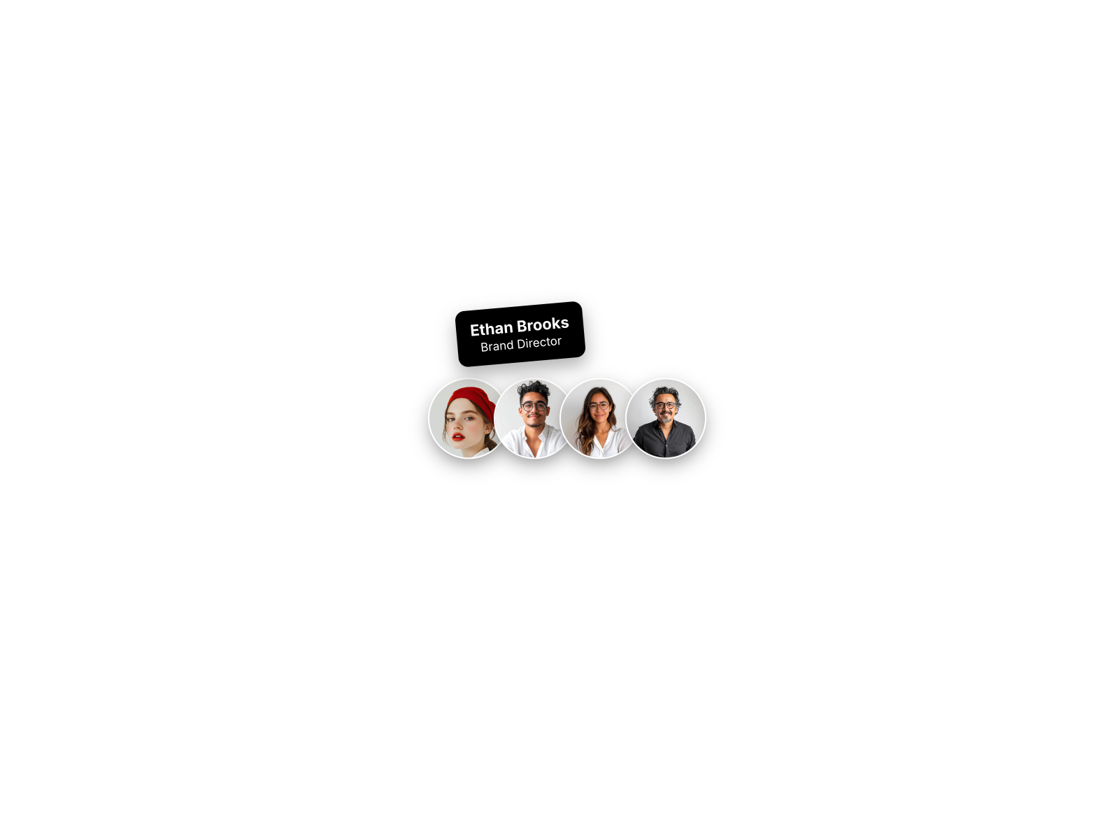
Animated Tooltip — Spring-animated avatar stack with name and role tooltips
by Alberto
Animated Tooltip packages a hoverable avatar row where each face expands a spring-animated label showing name and designation — Alberto built it on Framer Motion so the motion feels elastic rather than linear. Tune avatar size, gap, border color, tooltip padding, and vertical offset from the sidebar without touching overrides. At 10 USD it is narrower than general-purpose tooltips but unmatched for About pages and testimonial bands where the tooltip content is always a person, not a feature bullet.
- Best for
- Team sections and social-proof rows where avatars reveal identity on hover
Affiliate link — we may earn a commission at no extra cost to you.
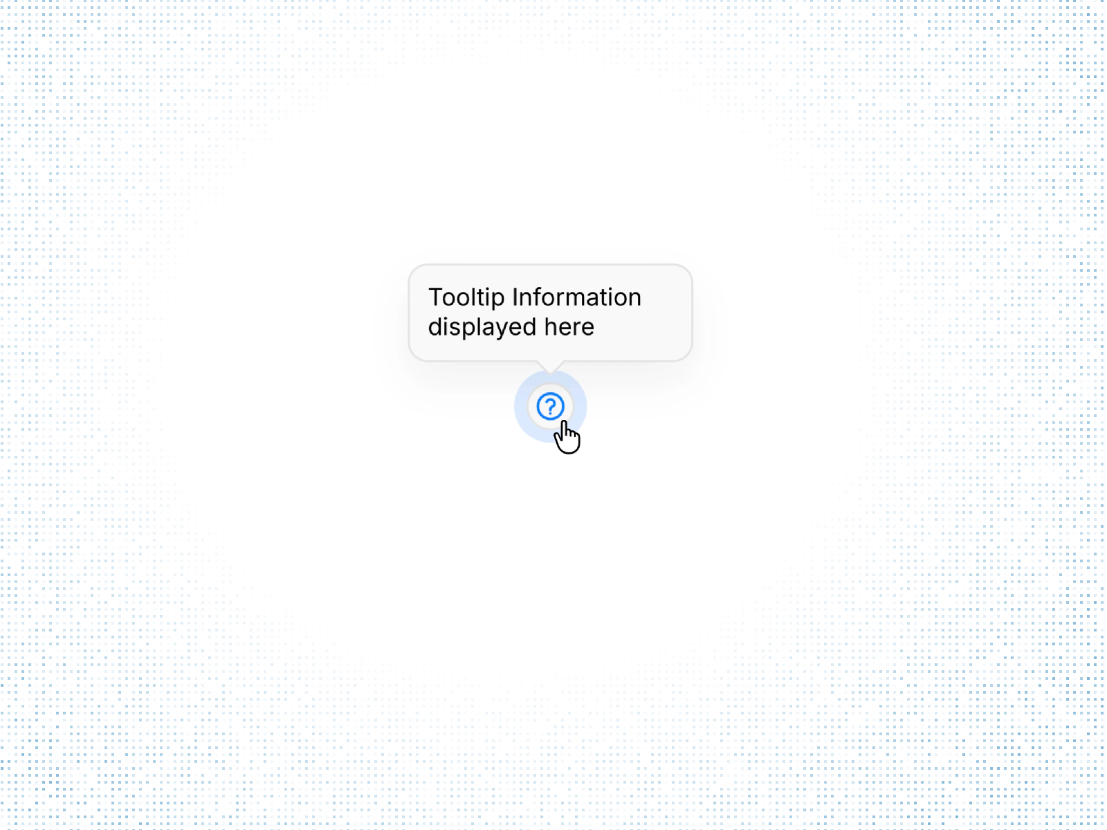
Tooltip Pulse — Pulsing icon marker with four-position hover tooltip
Tooltip Pulse pairs a subtle pulse animation on a customizable icon with a four-position tooltip triggered on hover or click — Iliyass OULAD keeps setup fast with built-in variants for top, bottom, left, and right placement. Colors, borders, padding, and tooltip copy all edit from the property panel, making it easy to scatter helper hints across pricing tiers or form fields. At 2 USD it is the budget attention-grabber when you need more visual cue than a plain info icon but less complexity than a full onboarding popup system.
- Best for
- Pricing tables and feature grids that need attention without modal overload
Affiliate link — we may earn a commission at no extra cost to you.
Quick comparison
| Resource | Price | Type | Best for |
|---|---|---|---|
| Smart Tooltips | Free | Component | Edge-aware hints with click-to-pin and accessibility |
| Smart Tooltip Popup | 7 USD | Component | Multi-step onboarding and rich media popups |
| Cursor Tooltip | 1 USD | Component | Pointer-following hints on links and sparse layouts |
| Premium Tooltip | 8 USD | Component | Classic icon-button tooltips with eight placements |
| Interactive Hotspot | 6 USD | Component | Image-anchored product spec callouts |
| Contextual Text | 7 USD | Component | Inline dictionary definitions in body copy |
| Animated Tooltip | 10 USD | Component | Avatar stacks with spring name labels |
| Tooltip Pulse | 2 USD | Component | Pulsing markers on pricing and feature grids |
How to choose the right Framer tooltip component
Match trigger style to content length. One-line form hints and nav glossaries fit Smart Tooltips, Premium Tooltip, Cursor Tooltip, and Tooltip Pulse. Multi-paragraph onboarding or media cards need Smart Tooltip Popup. Inline definitions inside prose belong with Contextual Text, and spatial product specs belong with Interactive Hotspot — do not force a single-line bubble where readers expect a card or a map pin.
Decide whether the tooltip anchors to an element or the cursor. Premium Tooltip and Smart Tooltips stick to trigger elements — predictable for icons and buttons. Cursor Tooltip and Contextual Text follow the pointer, which reads better on editorial layouts and long text blocks. Animated Tooltip is its own pattern: the trigger is an avatar, not a generic glyph.
Budget free positioning first, then buy specialization. Smart Tooltips free covers most icon-and-label work with smart flipping and keyboard support. Spend 1–2 USD on Cursor Tooltip or Tooltip Pulse when motion or cursor tracking is part of the art direction. Reserve 6–10 USD for Interactive Hotspot, Contextual Text, Smart Tooltip Popup, or Animated Tooltip when the use case is product tours, inline glossaries, image callouts, or team identity reveals.
Test hover gaps on touch devices. Pure hover tooltips hide information from mobile visitors unless you add a click trigger or duplicate the copy in visible body text. Smart Tooltips and Smart Tooltip Popup both support click modes — enable them on any route where more than half of traffic is mobile.
Our top pick for most Framer builders
If you install one tooltip component site-wide, Smart Tooltips free is the balanced default — edge-aware placement, click-to-pin, and accessible dismiss behavior without a marketplace spend. When the brief is cursor-adjacent editorial hints, Cursor Tooltip at 1 USD is the best value upgrade. For product onboarding that needs images and steps, Smart Tooltip Popup at 7 USD replaces a custom modal build; for team rows, Animated Tooltip at 10 USD is the purpose-built avatar stack.
Browse Framer templates on yoframer for layouts with dense UI that benefit from tooltip layers, or read our popup and modal roundup when the interaction needs a full overlay instead of a hint bubble. More resource roundups live on the Resources hub.
Updated July 2026. We refresh this list as notable tooltip components ship, reprice, or go stale.